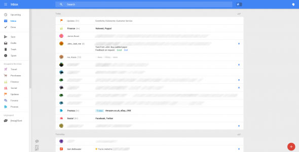
Google is reportedly testing a major design change in Gmail for the desktop version. The change reflects great improvements in the UI of Gmail.
The new layout looks a lot cleaner, lot less cluttered and also seems to match quite well with the Gmail apps look for mobile devices; the design also keeps in mind the different screen sizes of the users.
As I said, the changes are not with the design and look alone, but quite some new features are added in the test version too. For instance, you can now snooze your email and also create reminders within Gmail.
The static sidebar in Gmail is replaced with a fly-in menu. There are bubbles to create email and reminders at the bottom right.
Starring system will be replaced by pinning. You can choose to have all the pinned emails above the regular emails via the sorting system if you wish!
The (new!) Gmail tabs will also be gone – replaced by a “grouped inbox” feature where your emails will be automatically sorted by topics: Travel, Purchases, Finance, Social, Updates, Forums, and Promos – but this feature sounds to be interfering with users’ preferences and might trigger the same response that was triggered when the Gmail tabs were introduced.

It is not clear if we can edit/modify these categories – I assume we cannot. If the categories are editable, it would be great though!
“There’s no expected release date for any of these features, or even a guarantee that Google will implement them in the way we see them in these images, but after spending a few minutes in this interface it is clear that Google is eager to shake things up in Gmail. With any luck most of these features will make the cut and we’ll see an all new Gmail any day now.” – says, Russell Holly of Geek.com, who had the chance to test the new design.
And, the Hangouts is integrated in Gmail too. Most probably, clicking on the chat icon will enable a text based chat or a video chat right within Gmail.
Oh and it seems to you sort multiple incomplete (draft) emails and/or reminders like a To-Do list – so you can finish them one by one. This one is for me 🙂
As Russell says, this design might not be even launched to the public. But given the recent major changes made by Google in many aspects (like the Docs and Spreadsheets app) and given the introduction of its new product Classroom, I can say Google is on to something big.
And Google has always been for integration and uniformity when it comes to its products. So I am expecting to see this new design in my inbox quite soon. What about you?
