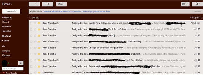
Google changes colors quite often. Now, it is time for Gmail Renovation. Gmail offers users a new interface which will be an option until the refinement process is completed. After getting users’ feedback, Gmail’s new interface will be no more an option but a compulsion.
So, here is an opportunity to taste and see the new features and provide feedback that will be taken into consideration by the Gmail Team. The appearance and functionality of Gmail is completely redesigned to make it simple, to access options quickly and to use Gmail across multiple systems.
The layout, functionality and aesthetics are being skimmed to let users experience the same look and feel across desktops, laptops, smartphones and tablets.
Contents
Gmail’s redesigned toolbar
In the new Gmail, the toolbar options are not visible until you select a mail or open a message. Options like Archive, Labels, Delete, etc. will appear as icons with text hovering above them stating the usefulness of those icons. You can mark the importance of a mail by selecting icon next to the sender’s name.
Now, settings can be accessed through new gear icon. Using this, you can change your theme and access all other settings of your email account. You can also get help from it.
The new set of options help you choose various display densities to match the device that you are using, be it a notebook, a tablet or a smartphone. You will be able to get the best available display on the screen of the device that you are using.
Gmail’s redesigned left panel
The changes on the left panel allow you adjust chat lists and label lists. You can minimize label list or chat list to get the most from them. The change makes your access fast and convenient.
If you are using gadgets like Calendar or Quick Links Lab, you can toggle between gadgets and chat lists by clicking on the appropriate icons. You can even disable the chat services by opting for the same in the settings.
Mail Area
The compose button will be red instead of pale gray color. Of course the color will be different if you have opted for a special theme.
Now, you will be able to navigate through the list of emails using the up and down arrows on your keyboard. Email conversation is made more realistic by arranging text in chronological order with users’ profile pictures.
This will let you trace the conversation more easily and efficiently. The reply button has been changed to an icon. Starring is present to the right side of the reply button. You can send a fast reply by clicking on the Reply button at the bottom of the conversation.
The Archive, Spam and Delete buttons will be fixed on the top. So, there is no necessity of repetition of the same at the bottom of the page. Hence, you will be able control your mails more easily.
The new design will let you fill Gmail to any size window. After resizing, horizontal and vertical scroll bars will be created automatically through which you can move up and down the list of emails.
New Gmail Search box
You can still use the search box to search mails as well as to search from the web. Search box is customized to get exactly what you want. From the advanced option, you can create a custom filter in the search box that will take action automatically as per the settings of the filter.
New Gmail themes
The newly added high resolution and high definition themes will be more appeasing to your eyes. Some of the old themes are phased out which cannot accommodate to the new environment. You can access, change and apply themes from the settings.
Negative side
The new design was welcomed by millions of Gmail users worldwide. However, the design has not addressed some issues like API improvements, default colors and elasticity on the left pane. It is still hard time for developers as they are not provided with a bunch of APIs that they can work with to develop third party applications that will seamlessly integrate with Gmail.
Besides the difficulty in selection of left pane to adjust space between chat lists and label lists, a lot of empty space remains in the mail area. The colors, brightness and contrast are not so appealing. Gmail design team has to work out more in the coming days by taking users’ feedback to deliver the best in line.
